
Power of Animated Charts - Dynamic of Third World Myth
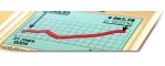
Power of Charts
Throw some parameters
- on the x-axis,
- another on the y-axis.
- show changes over time.
- add a third dimension
- change the level of granularity and aggregation
- use circles, bars, lines, colors, and different shapes
- map data to geographical regions
- use colors, shapes, line styles, etc.
And voilá. You may gain access to understanding very complex developments and dependencies within a glimpse of an eye.
Check out this 22 minutes long video of a presentation at some conference.
Hans Rosling: Debunking third-world myths with the best stats you've ever seen (↑)
About this Talk: You've never seen data presented like this. With the drama and urgency of a sportscaster, Hans Rosling debunks myths about the so-called “developing world” using extraordinary animation software developed by his Gapminder Foundation. The Trendalyzer software (recently acquired by Google) turns complex global trends into lively animations, making decades of data pop. Asian countries, as colorful bubbles, float across the grid -- toward better national health and wealth. Animated bell curves representing national income distribution squish and flatten. In Rosling's hands, global trends -- life expectancy, child mortality, poverty rates -- become clear, intuitive and even playful.
You will learn a lot about
- state of the World economy
- quality of human life
- on different continents,
- in different countries
- most importantly changes over time.
- The sheer power of animated graphic data representation
Did any TV reports give you such high a density of overview about where the human race is standing? I guess not. They are accustomed to report about the worst and best cases only. Media in general gives a very poor representation of overall situations.
Policy makers, business owners, and managers need to make decisions based on the overall situation. As this professor points out it is important to have free access to data and have software tools that allow for querying, correlating, and representing data in intuitive ways. That's not only true for global data, that hold true for your business data as well.
Imagine Google pickep up on that idea and gives us Google Global Stats on top of Google Earth.
Now, think about, what extensive data analysis can do for our business.
Yours
John W. Furst
P.S.: Special thanks to James D. Brausch, who pointed to that online video on his Internet Business 101 Blog (http://www.jamesbrausch.com).